This photography exhibition is one of the best I have seen all year at the Patty and Rusty Rueff Galleries! I love the diverse work that was created from a group of people who have worked closely together this year and the past years. Congratulations to all of you on your show and graduation.
My favorite works are the animals and the floating glass pieces. I love the animals, because it makes me question if it is a real photo or not. I want to know if it is appropriated or if they acquired all of these animals and photograph them so beautifully. There is real skill and artistry in these images. I also want to know why 3 of them have white backgrounds. Those 3 though make me think these were all taken, because of the drop shadows on the images. The floating glass pieces are intriguing. I love that the images are not opaque and can be seen through. They are very interactive and how a lot of layers of multiple emotions. I love the way it is displayed and integrated into the show space. It is a real wow factor and really commands the room.
Showing posts with label Extra Credit. Show all posts
Tuesday, May 3, 2016
Intra-Corpus: Caroline Owen
Etchings and Digital Prints
I love how she talks about the importance of body communication with this body of work. I love the emotion and sense of comparison between the multiple exposures of the piece. The fine detail layered over the images adds another depth to the piece. There is a turmoil found in these pieces, making you question what is going on with this woman in the pieces. I want to know what she is thinking, why she is reacting, and how I can help her. I feel almost like a sense of lost or isolation, because of the unfinished staged background and movement between the same subject in the works. I want to know if the folds in the background are relevant, or that this subject was photographed on one day, or it seems so, her hair is all the same. I enjoyed this body of work very much but would love to know the answers to my questions.
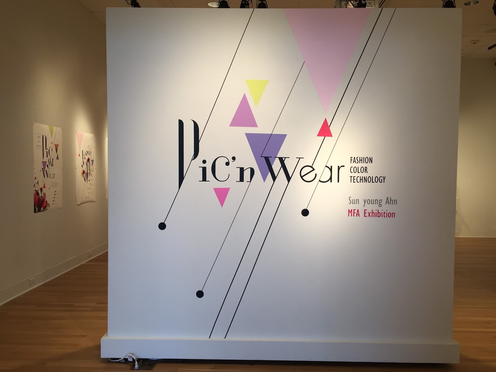
Pic'n Wear- Sun young Ahn
Interactive way of creating your own textile, color picked from an image color composite.
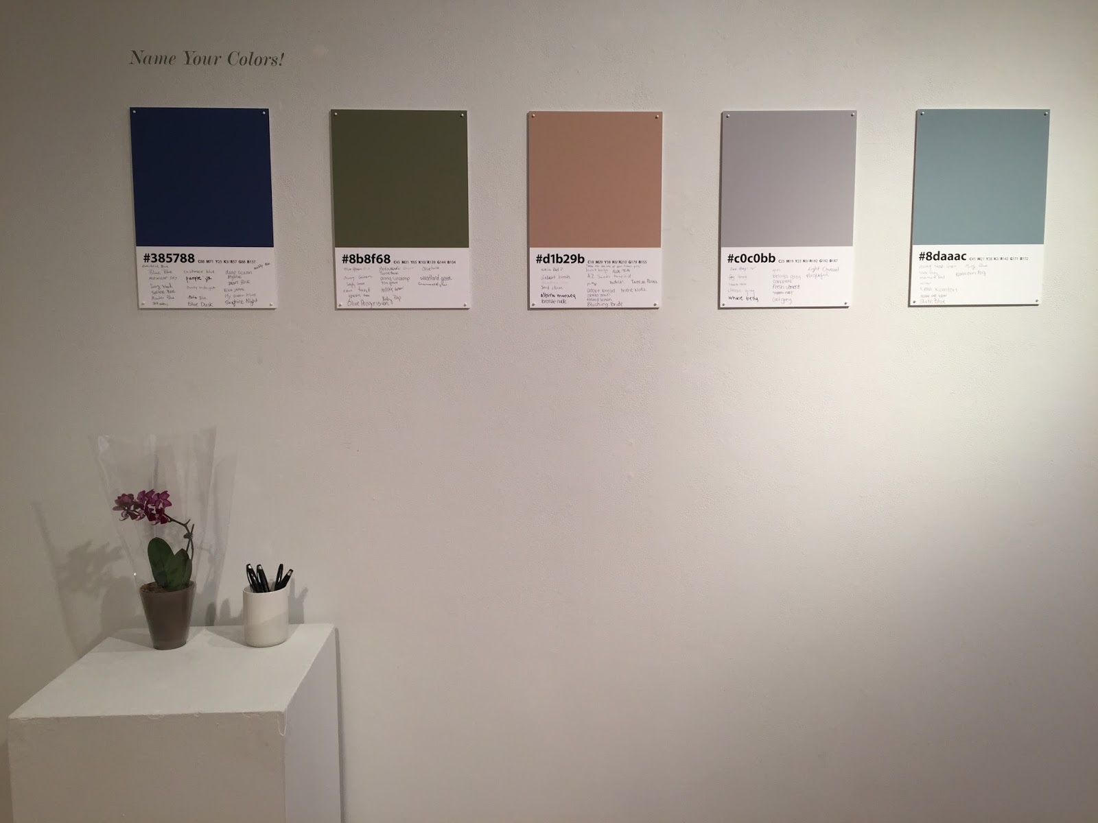
She invited all viewers to create their own names for these colors.
I really enjoyed how bright and colorful this show was. I enjoyed the way she incorporated the audience into the full experience of the project. I loved being able to create my own patterns like the first ones shown for this body of work on this blog. I never really questioned how people relate to the name of a color as much as the actual color. She showcases this idea very well throughout the whole show. I want to use this program to create my own scarf. I love how she mixed her fashion background with her MFA work to create such engaging work.
Thursday, March 17, 2016
The Under Graduate Exhibition
Scott See “Cavern in Embers” Kallitype
I really love the richness of this image, I can see why it received
the Photography award. The saturation of the blacks and subtle details in the
highlights makes this a really great image. I love the large borders of the
matt around the image, it really sets the image in the frame. Well done on this
image and award.
Miranda Herring “Constructed Home” Woven and Constructed
Textile
This wonderful piece won the Design Award. I love how this
weaving is suspended in the air and not on a fixed pedestal. It creates an experience
in a space rather than just a viewing of it. I enjoyed being able to see the
work in the full round. I want to be able to touch it. I love the detailing in
the process that can be seen. I am fully impressed and wish I could do this.
Chelsea Exl “Nest” Copper, Brass, Nickel
I just wanted to pick this up and try it on! Way to go
Chelsea on the Fine Art Award it is well deserved! I have dabbled in some
welding, and I have no idea if that was done for this but I am totally
impressed. I love the delicate nature of the whole piece, the way it flows and
rounds out make it feel complete and intentional with a very not intentional
rustic quality to the piece! I love the different metals used to create a
subtle difference in the colors throughout the piece. I’m very excited I was
able to view this piece.
Sara Kramer “Portrait (Green)” Acrylic and Graphite on
Polypropylene
This piece won the Amie Award (First Prize). I am so
intrigued by this work because I work in the realm of realism. My mind cannot
even fathom the idea behind this piece. It is a mixture of realism and fantasy
all balled up into one. It reminds me of imagery associated with my favorite
band The Used. I would love to be able to see this being created! Love the
work.
Subscribe to:
Posts (Atom)